The investment industry and financial advisors use various marketing tools to educate clients about basic principles and guide their investing behaviour. Time value of money, power of compounding, risk versus reward, and the importance of diversification are just a sampling of topics often discussed.
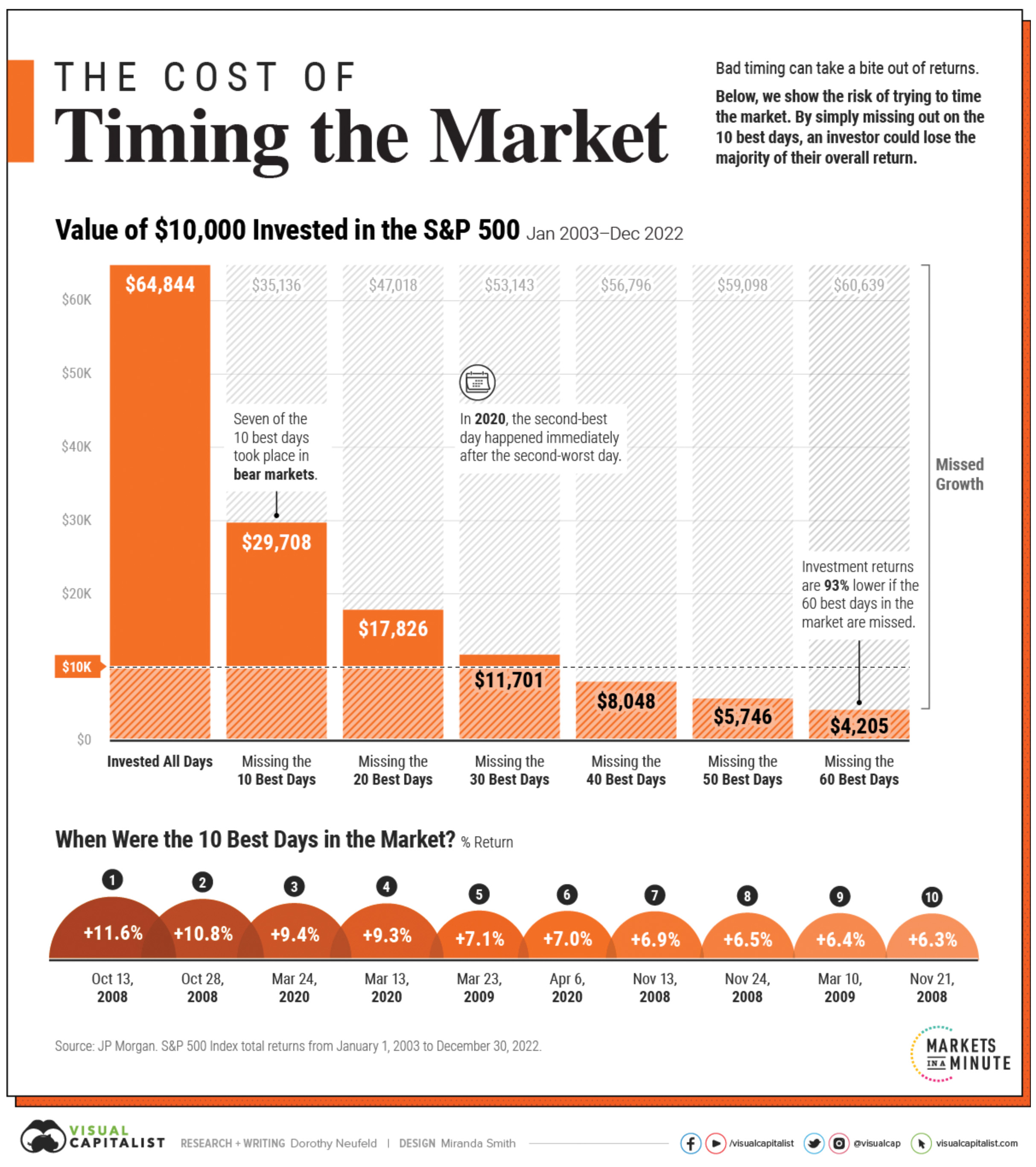
To help deter clients from pre-maturely selling during periods of market volatility, the industry often turns to one of its favourite charts. It’s commonly called the “missing the best days in the market” chart. For as long as I can remember, I’ve seen iterations of this chart produced by just about every large investment firm. To avoid calling out any specific financial firm, I’ve included an example of this kind of chart produced by Visual Capitalist.

Source: Neufeld, Dorothy. “Timing the Market: Why It’s So Hard, in One Chart.” Visual Capitalist, August 14, 2023.
One of the investment industry’s favourite charts
The chart typically displays the long-term performance of a broad market index, such as the S&P 500 or the S&P/TSX Composite, while also showing the hypothetical performance if an investor missed the best 10 days, 20 days, 30 days, etc., of those markets.
The intended purpose of this chart is often to highlight the importance of staying invested and avoiding the temptation to sell investments during periods of market volatility. It illustrates the potential consequences of not being invested and missing out on the best days in the market.
Using the Visual Capitalist chart example, $10,000 invested in the S&P 500 using a buy-and-hold approach from 2003 to 2022 would grow to $64,844, providing the investor with a very attractive total return. However, if an investor sold the investment (usually during periods of fear and panic) and somehow managed to miss the best ten days, their total return would only amount to $29,708. The consequences of that poor market timing would be a greater than 50 percent reduction in the total value of their investment over the 20 years. The charts also exhibit the even worse returns an investor might experience by missing more of the best days in the market.
The implication of these charts is clear. They argue in favour of buying stocks and holding them and aim to deter investors from panic selling or trying to time the market. As the adage goes, “time in the market” is more important than “timing the market.”
Driven by good intentions, but incredibly misleading
While I agree with the general conclusion of these charts, I believe the argument is based on false premises and misses several important points. Large daily gains often occur close to large daily losses during periods of elevated market volatility. Therefore, you can’t compare the results of missing the best days in the market without analyzing what would happen if the investor also missed some of the worst days.
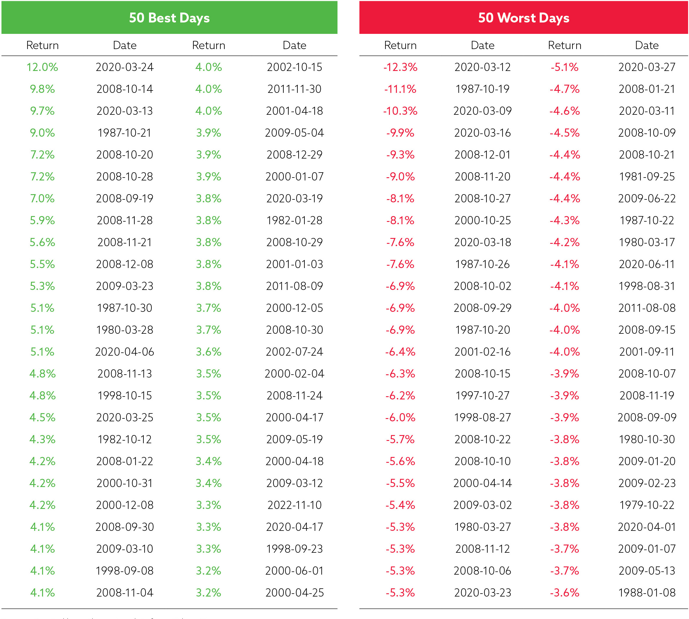
To illustrate this point, let’s examine S&P/TSX Index daily return data from July 1979 to May 2024. The table at right displays the 50 best and 50 worst trading days over that time period.

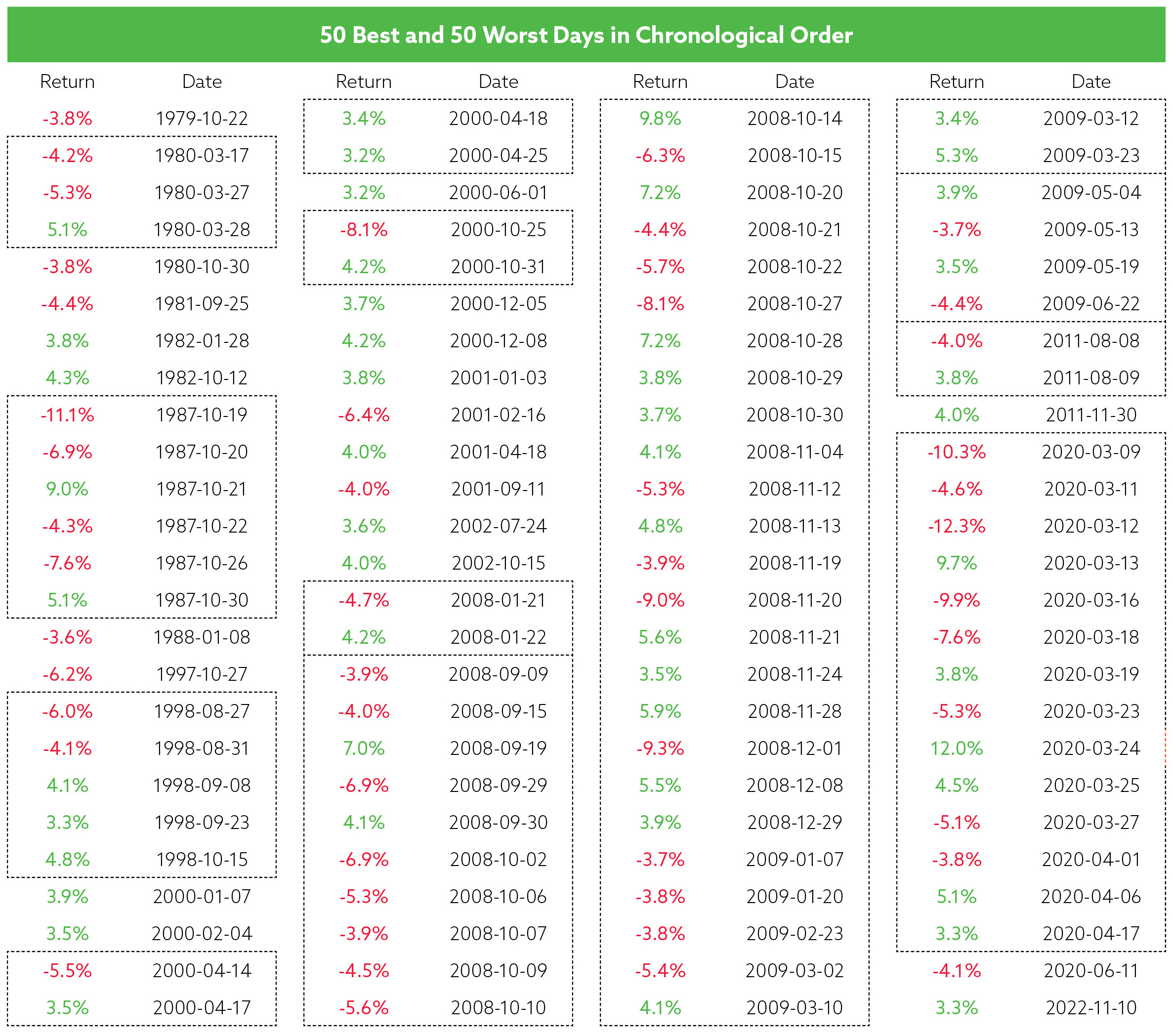
Next, let’s rearrange the 50 best and 50 worst trading days (100 days in total) in chronological order to highlight some key observations. The dashed lines emphasize periods of market turmoil in which large positive and large negative changes occurred in close proximity to each other.

October 1987 contains six of the largest daily moves, including Black Monday (October 19, 1987) when stock markets worldwide crashed. Over this two-week period, consisting of ten trading days, markets oscillated between large gains and large losses. It would be extremely unlikely that an investor during this period would miss only the large gains (October 21 +9.0 percent; October 30 +5.1 percent) without also avoiding at least some of the large losses (October 19 -11.1 percent; October 20 -6.9 percent; October 22 -4.3 percent; October 26 -7.6 percent).
The global financial crisis period between September 2008 and March 2009 contained a whopping 37 of the largest daily moves! Again, the markets swung between losses and gains during this entire period. It would be virtually impossible for an investor to miss the seventeen best days without missing many of the twenty worst days during the turmoil.
The pandemic-related market turmoil in March/April of 2020 also exhibits a similar pattern. The six best days during this period were co-mingled with eight of the worst days. Investors very rarely jump in and out of the market. But even if they did, it’s highly unlikely they would be at risk of missing only the best days in the market.
An oversimplified chart that completely ignores risk management
By focusing only on the best days, these charts completely ignore the beneficial impact of missing some of the worst days. An investor who stayed invested through the best days likely also experienced significant portfolio drawdowns, offsetting much of the potential gains. By missing some of the worst days in the market an investor would better preserve their capital and generate better returns than they would by staying fully invested.
It’s also worth noting that gains and losses aren’t equal. The average daily return of the best 50 days is +4.76 percent, while the median return is +4.05 percent. Meanwhile, the average daily return of the worst 50 days is -5.70 percent, while the median return is -5.19 percent. And a 5 percent gain does not help a portfolio fully
recover from a 5 percent loss. In fact, a 5.26 percent gain is required to restore a 5.00 percent loss. Considering this math, missing the worst days should lead to better results than participating in the best days.
The investment industry and financial advisors have an important role in educating clients about the unintended consequences of market timing and the importance of staying committed to a long-term investment plan. We are held to high ethical standards as clients trust us to offer fair and balanced information and advice. Since the best and worst days often occur close together, a chart that only shows the consequences of missing the best days is misleading. Investment firms should stop producing this chart and financial advisors should stop showing it to their clients. 